Air quality explainer: what do the numbers mean?
With bushfire smoke affecting large areas of Australia, more people than ever are seeking local and up-to-date air quality information.
There are a number of places you can get air quality information, but it is important to understand where the data are being sourced from and some important differences in the way air quality information can be reported.
What numbers does AirRater report?
AirRater reports the amount of PM2.5 (fine particulate matter) in the air, shown as micrograms per metre cubed (µg/m3). The ‘2.5’ part of PM2.5 refers to the size of the particles, which have a diameter less than 2.5 micrometres (0.0025mm). This is about 3% of the diameter of a human hair.
PM2.5 is the most important air pollutant in bushfire smoke. The higher the amount of PM2.5 and the longer you are exposed to it, the more likely it is to affect your health.
For more information about what you can do when it’s smoky, see our fact sheet – What can I do when it’s smoky outside?
Why are the AirRater numbers different from the ones on government websites?
Some people have noticed that the numbers in AirRater are different from those on government websites in regions such as NSW and the ACT.
AirRater draws air quality data directly from state and territory government air monitoring stations and we work closely with the government air quality agencies.
But there are important differences in how the data are presented, which means that the numbers (and air quality ratings) can’t always be directly compared.
There are two important points to consider when looking at air quality data.
Time Period
AirRater presents data that are as up to date as possible, so that we can support people to make the best decisions at that time.
In most states and territories AirRater updates the PM2.5 information every hour, and the data displayed show a 1-hour average. In Tasmania, the readings are updated every 10 minutes.
The time period shown on state and territory websites varies but can be a 24-hourly average. Always check to see what time period the number represents.
Air Quality Index
AirRater shows air quality as the amount of PM2.5 in the air.
In contrast, many state and territory government websites present air quality information as the ‘Air Quality Index’ or AQI.
The AQI was designed as a way to standardise information across different types of air pollution. It can be calculated for a number of pollutants (including fine and coarse particulate matter, carbon monoxide and ozone). The AQI number is not a raw measurement (e.g. micrograms of pollutant per metre cubed of air), but a scale based on how much the reading is above (or below) the air quality standard. Some states and territories provide the AQI separately for different pollutants, others provide only a composite AQI that is based on the pollutant that is the worst. For more details on how the AQI is calculated in your area, please see your local air quality agency’s website.
Importantly, for PM2.5, the AQI is calculated from a 24-hour average. The rolling 24-hour average used to calculate the AQI means the numbers you see on those websites may change more slowly in response to changing conditions than the 1-hour or 10-minute averages presented in AirRater.
Some state and territory websites also provide hourly or 10-minute data for specific pollutants including PM2.5, but you might need to click through to another part of the webpage.
Why doesn’t AirRater report the AQI?
AirRater doesn’t report the AQI because the AQI calculation for PM2.5 is based on a 24-hour rolling average, not the hourly (or 10-minute) averages that you see in AirRater.
In smoky conditions, PM2.5 is by far the most important air pollutant.
What does AirRater base its air quality categories on?
Each state and territory has a different system for rating air quality and providing public health advice.
AirRater’s air quality categories are based on the system used by the Tasmanian Department of Health for hourly PM2.5 You can view this at: https://www.dhhs.tas.gov.au/publichealth/alerts/air/trackairquality.
How does AirRater get air pollution information in places where there are no monitors?
If you are more than 20 km from a monitor, the air quality reading is an estimate from a global atmospheric model known as ‘CAMS’ (https://atmosphere.copernicus.eu/). This is the best information available, but it is less up to date and less reliable: for example there are delays before changing conditions can be incorporated into these models.
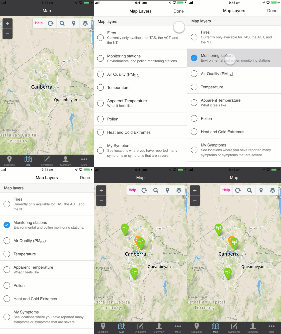
You can check if you are near a monitor by going to the map view, tapping the ‘Layers’ icon, and selecting ‘Monitoring stations’ from the list of map layers.
Air quality information shared through the app might be different from your local experience for a number of reasons, including rapid changes in the amount of air pollution, and rapid changes in the geographic areas affected, or due to technical problems with the data feeds. If the air quality seems different to the app display, then you should trust your senses!

What about other websites that provide air quality information? Should we trust them?
There are now many apps and websites that claim to provide air quality information.
Not all these apps and websites get their information from reliable sources. Not all of them apply the same formula to calculate the air quality category. Always check where the information is coming from and only trust data from validated air quality monitoring sources – such as those provided by government agencies.